Project Overview
Low Fare Calendar replatforming and redesign
Client: Southwest Airlines
Role: Experience, prototype, & interface design. Development support
Discovery
The original research and discovery was performed by Razorfish, the agency that Southwest leveraged to begin this transformation of Southwest.com. Razorfish ran in-depth competative analysis and analyzed internal performance metrics to map out the key use cases and highest impact areas of the Low Fare Calendar shopping experience.
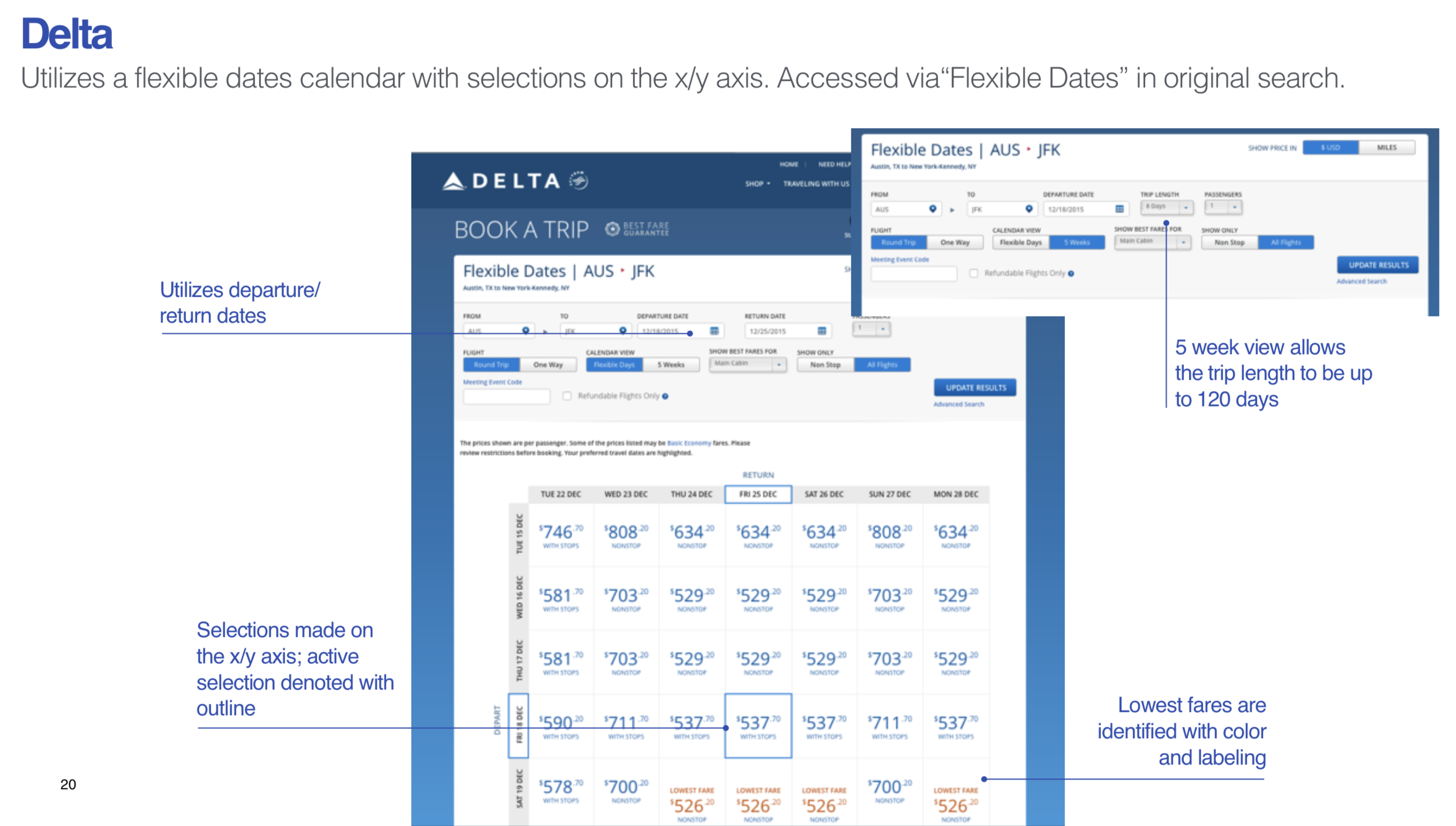
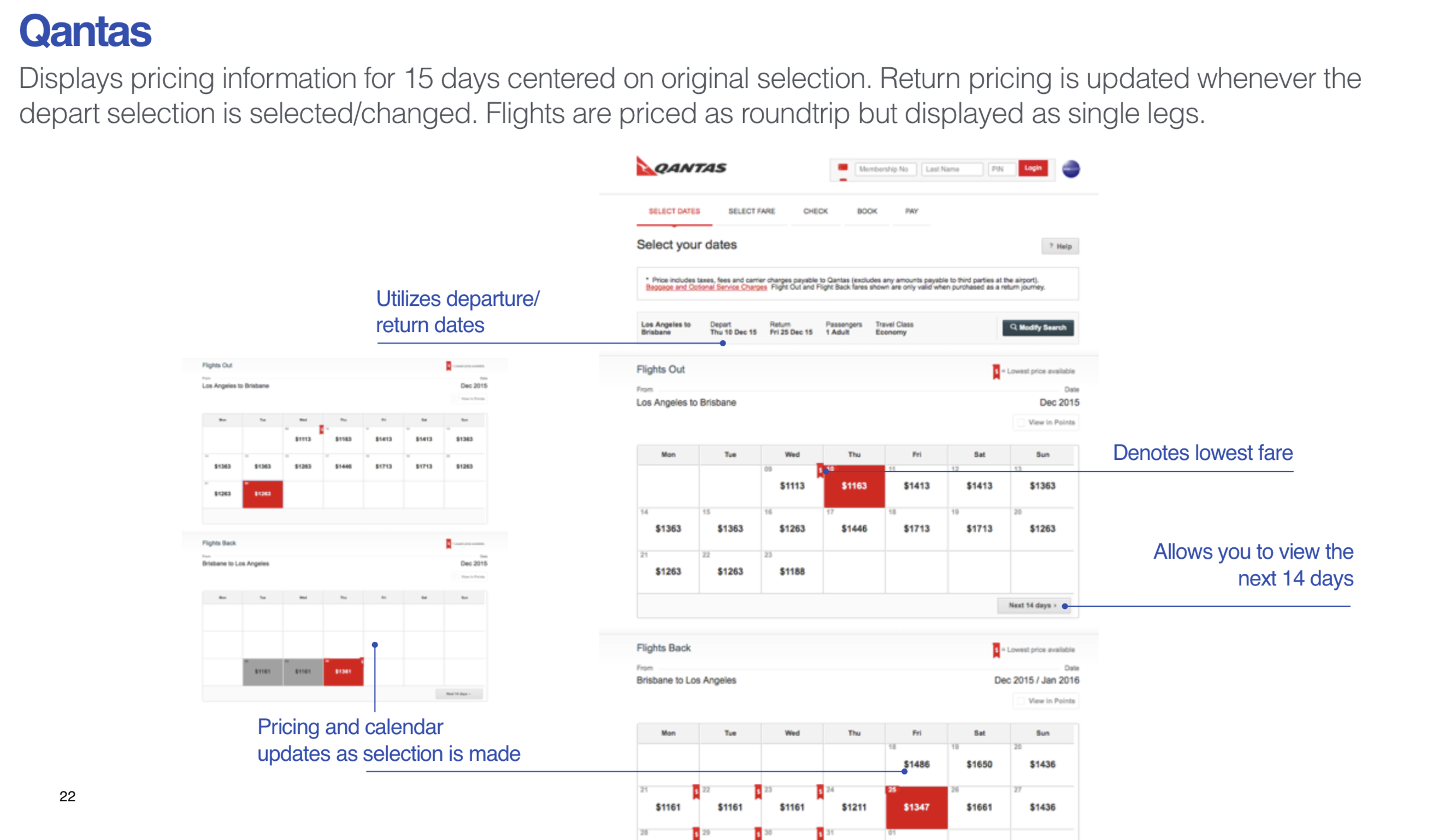
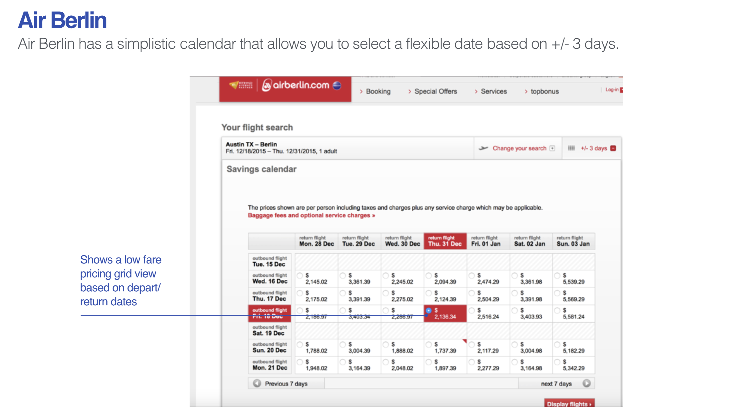
In their competative analysis, there were a few trends found in ways to present calendar-based shopping - week long ribbons, grids, and traditional calendar views.
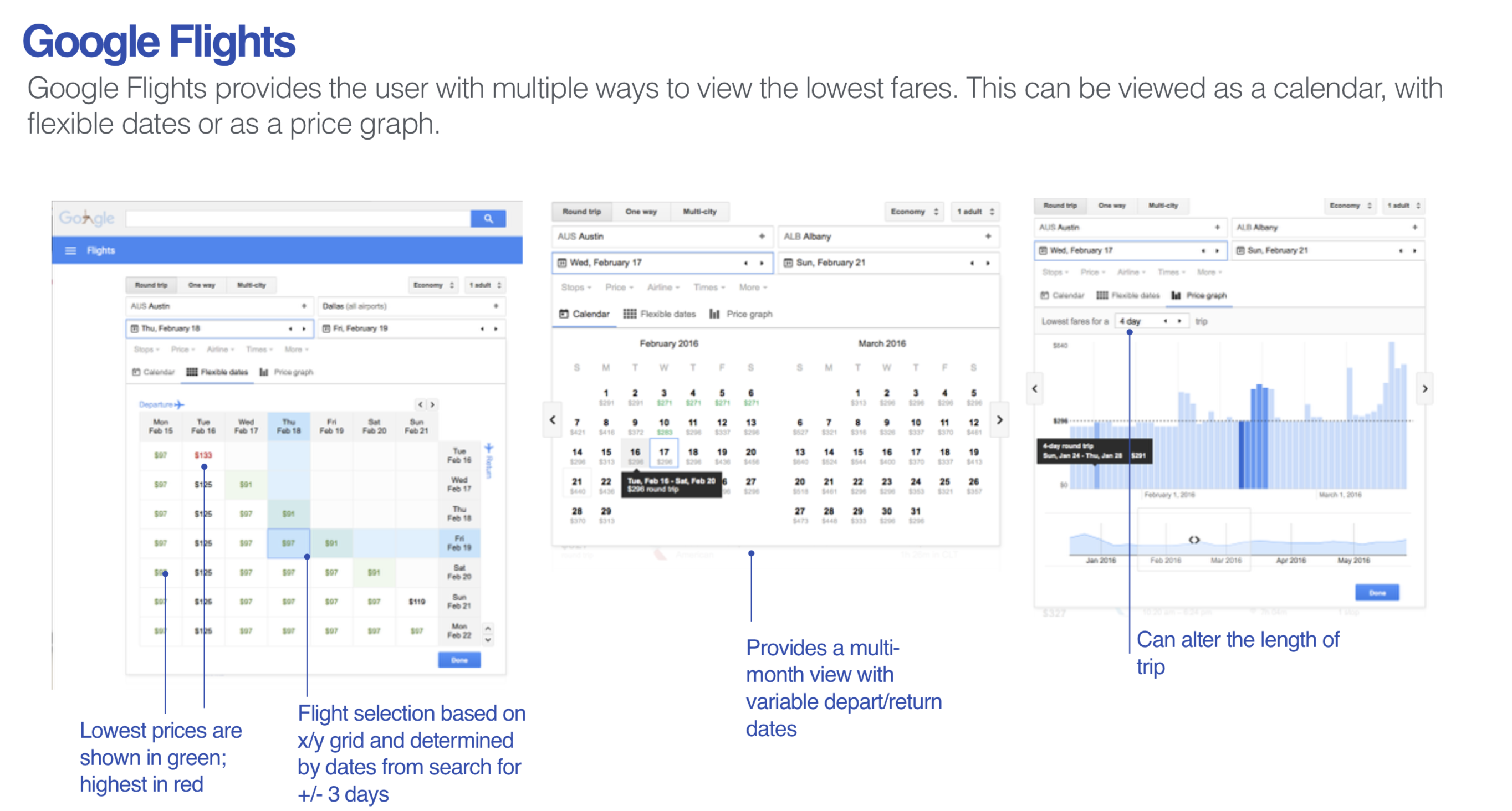

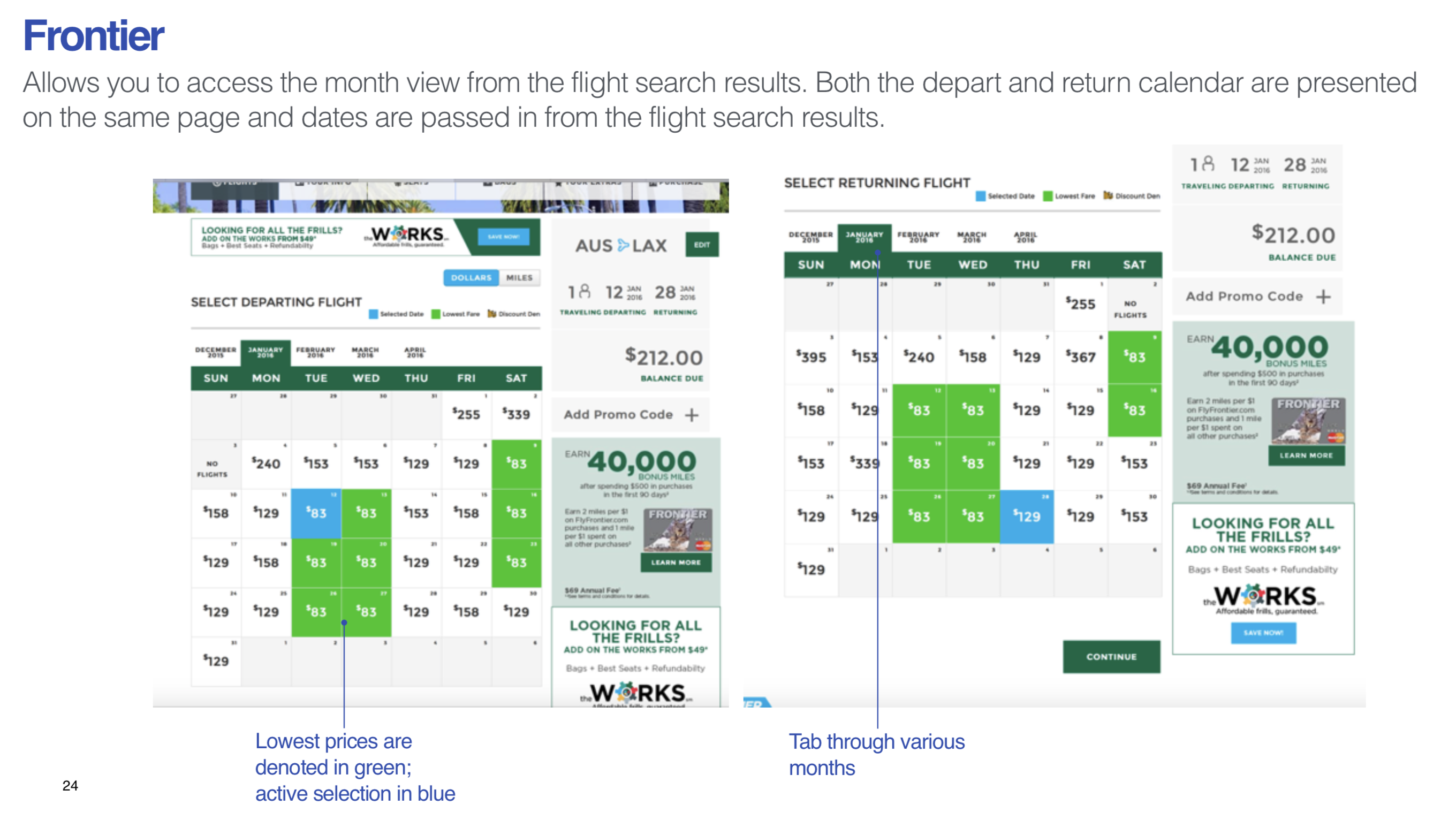
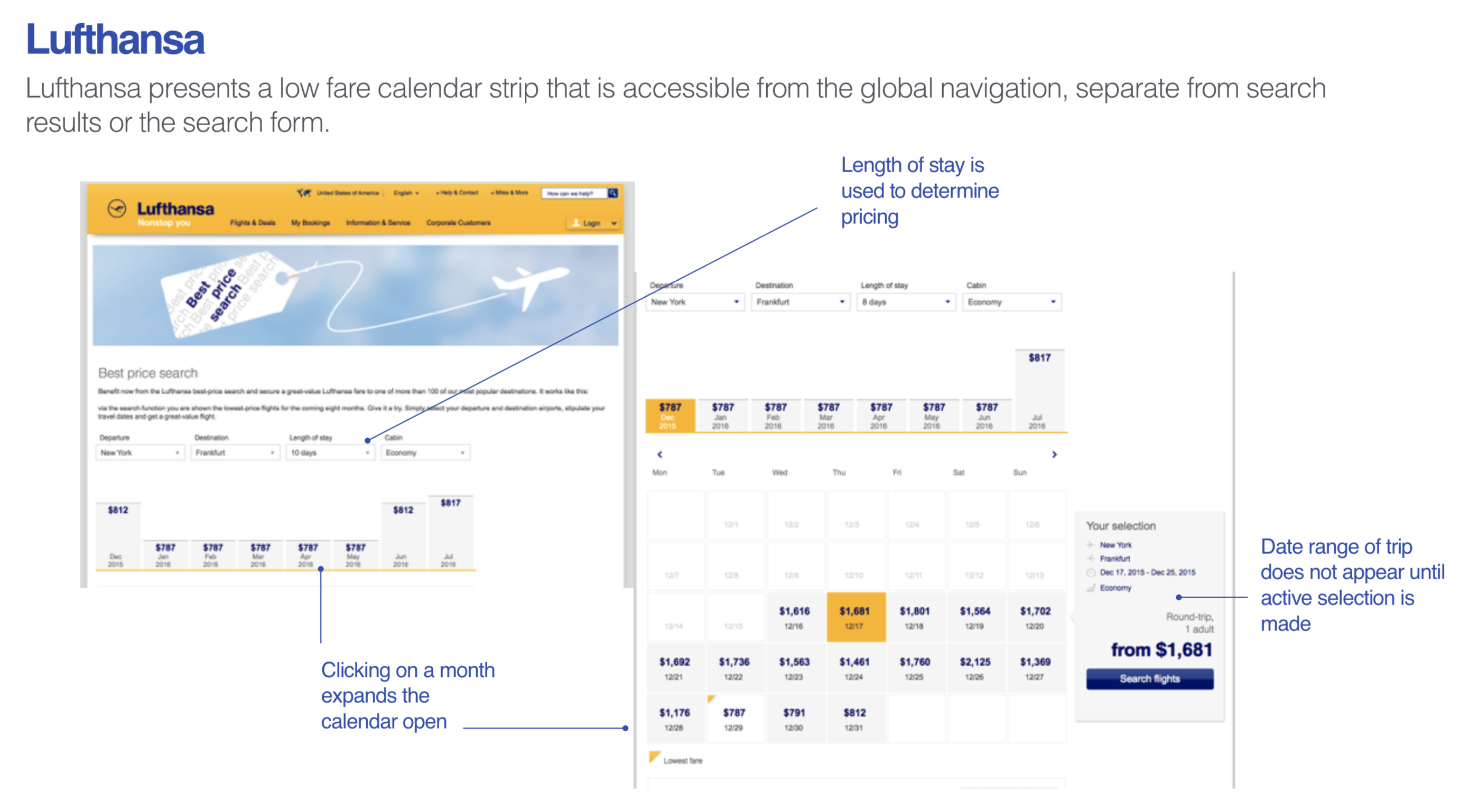
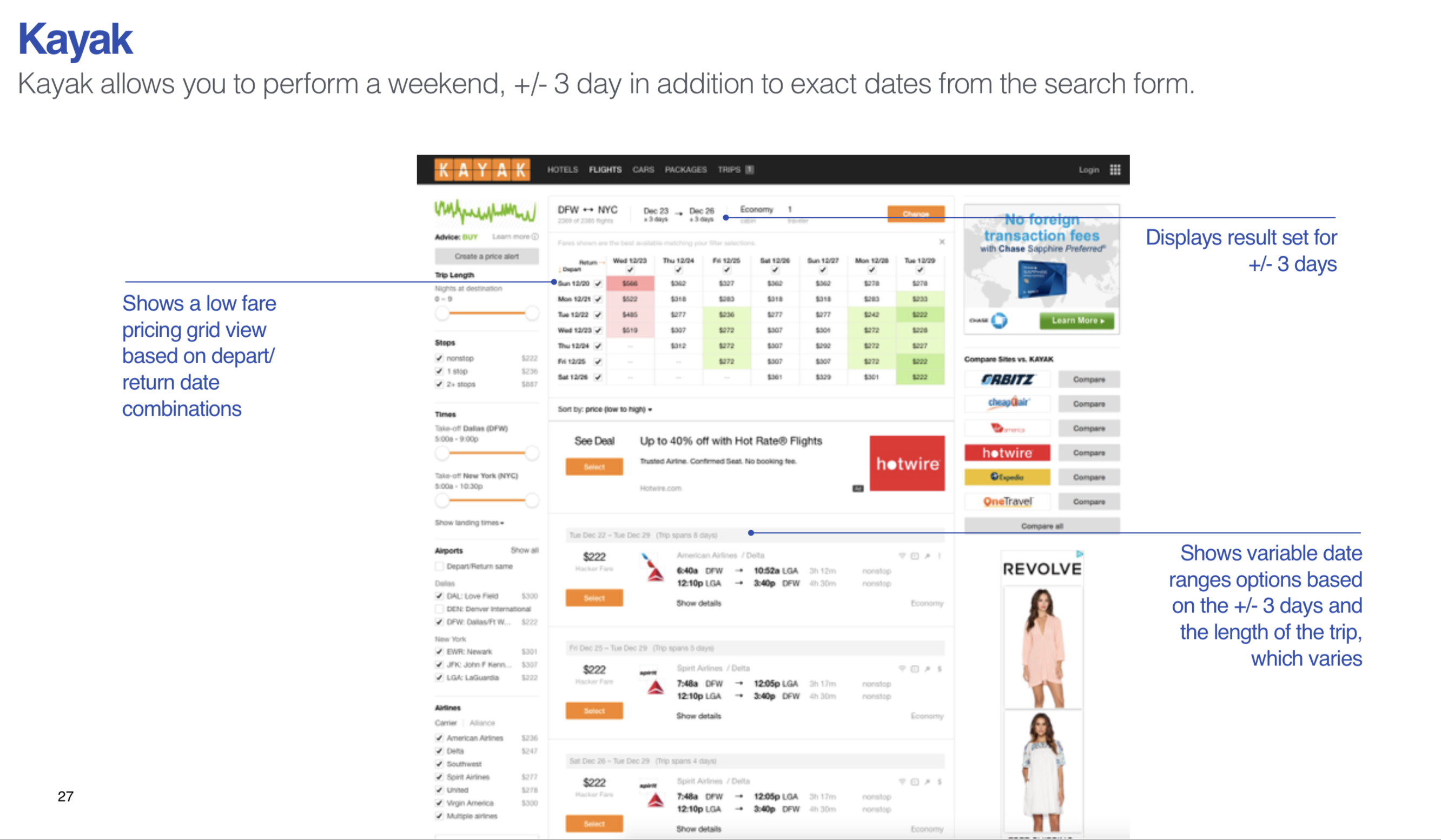
The recommendation from Razorfish was to leverage the traditional calendar view. This view was the one most similar to Southwest's current UI and provided the greatest flexibility for Customer browsing.
Wireframes & Prototypes
Razorfish also provided initial wireframes based on the limitations of the Amadeus engine that was powering the new Southwest framework. These wireframes allowed for a full month of pricing data to be returned with a price bar graph, as well as right interactions for various edge case bookings.
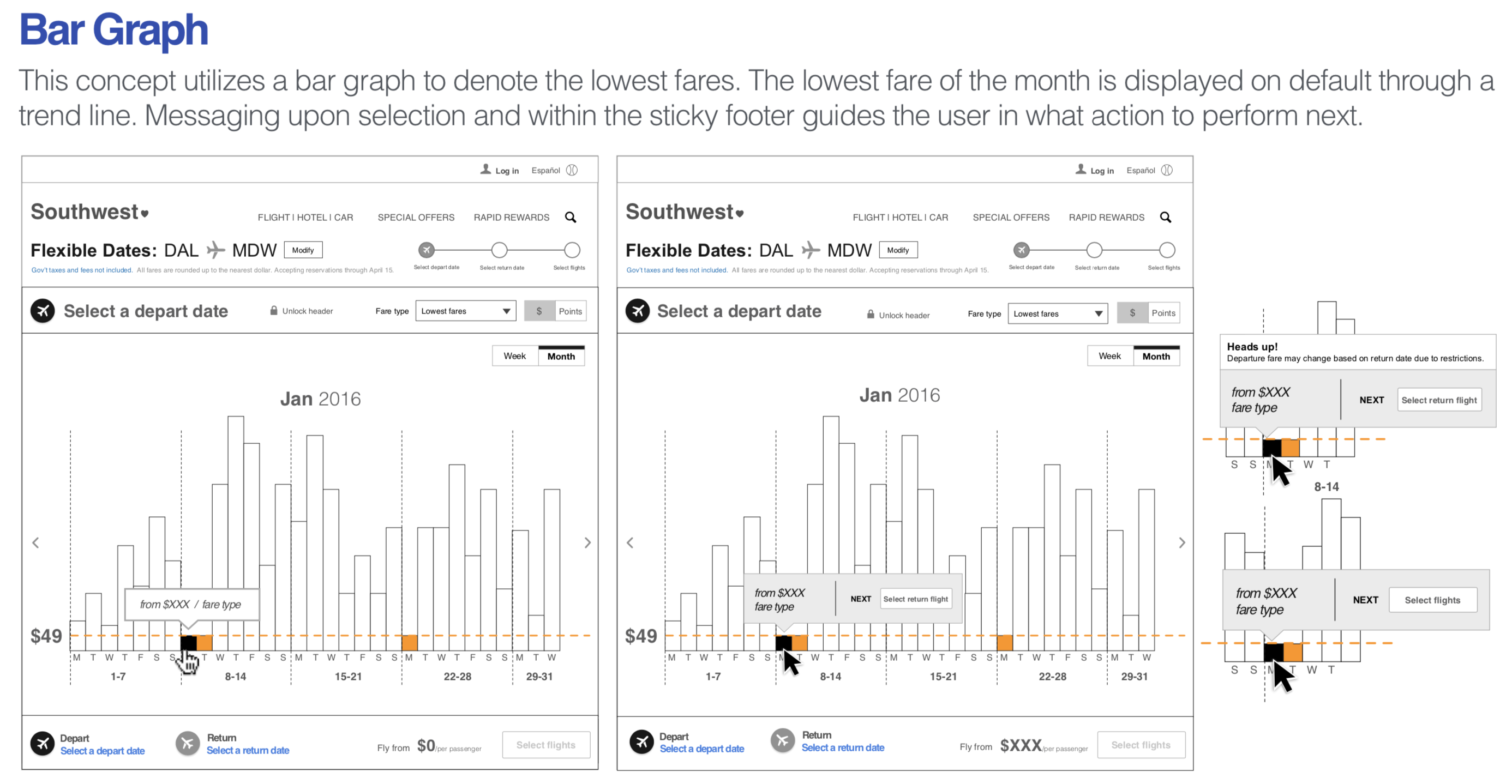

The engagement with Razorfish came to an end before this part of Southwest.com began development. I was brought on to the project about three weeks before devlopment was slated to start. In the time between the initial delivery from Razorfish and my engagement, there was a decision made at the program level that the Low Fare Calendar would leverage a "tabbed" treatment for selecting the departing and return flights in order to make the experience tablet friendly. There were also additional constraints discovered during prior development that prohibited many of the interactions and information displays contained in the initial wireframes.
As I began updating the wires to meet the new constraints, there were concerns with overall usability of the new experience. Using tabs to display the outbound and return parts of a trip wasn't a pattern used anywhere else, which left me concerned – would Customers understand that by clicking on the tab they were switching the part of the trip they were shopping for?
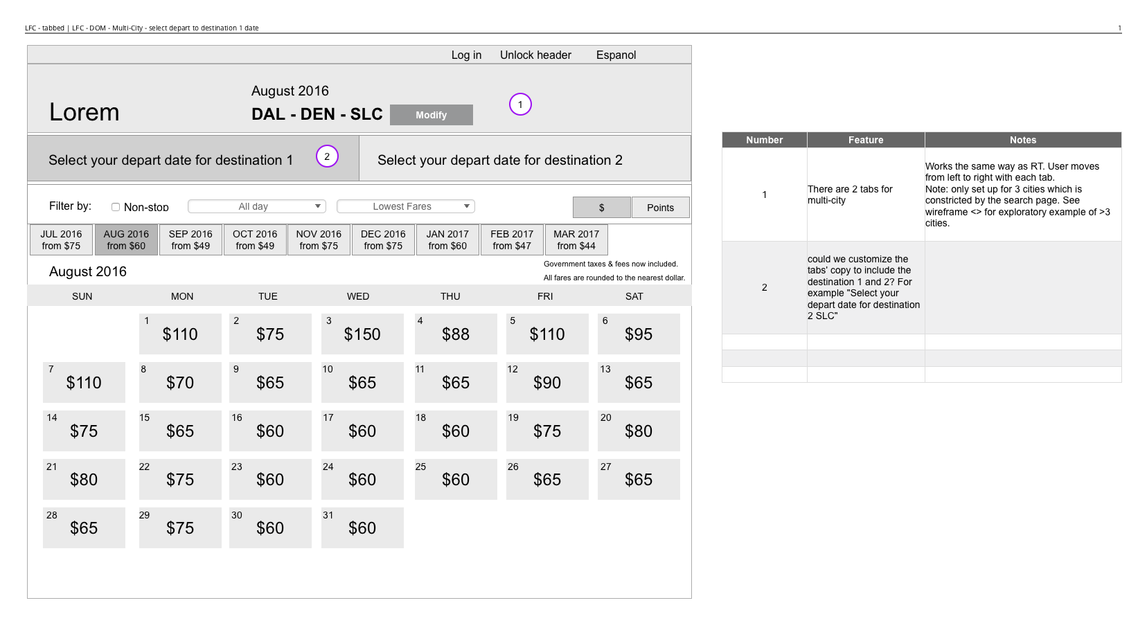
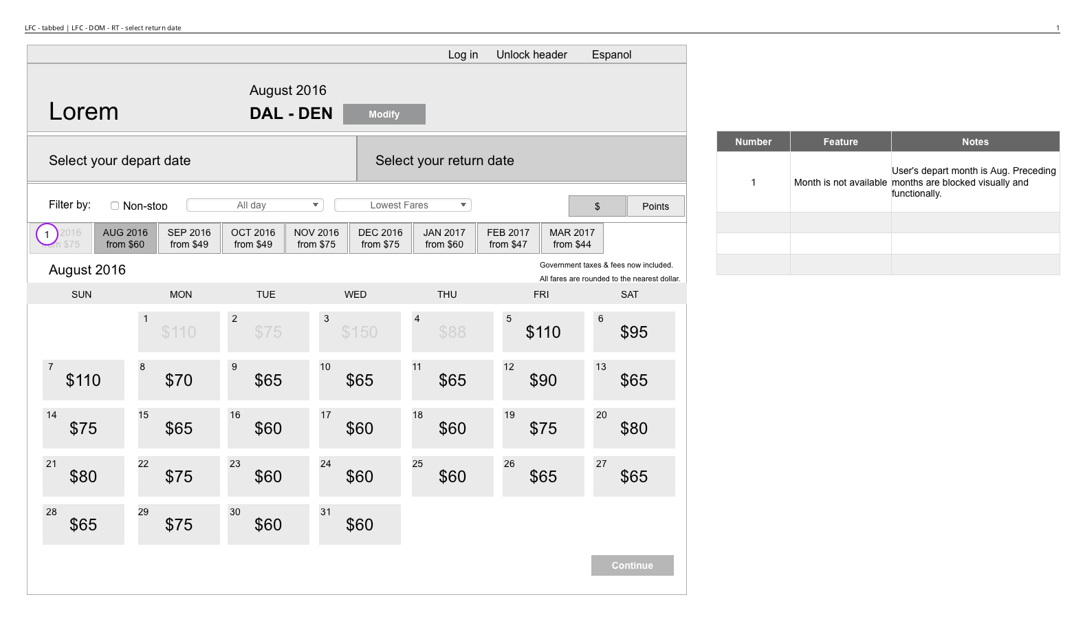

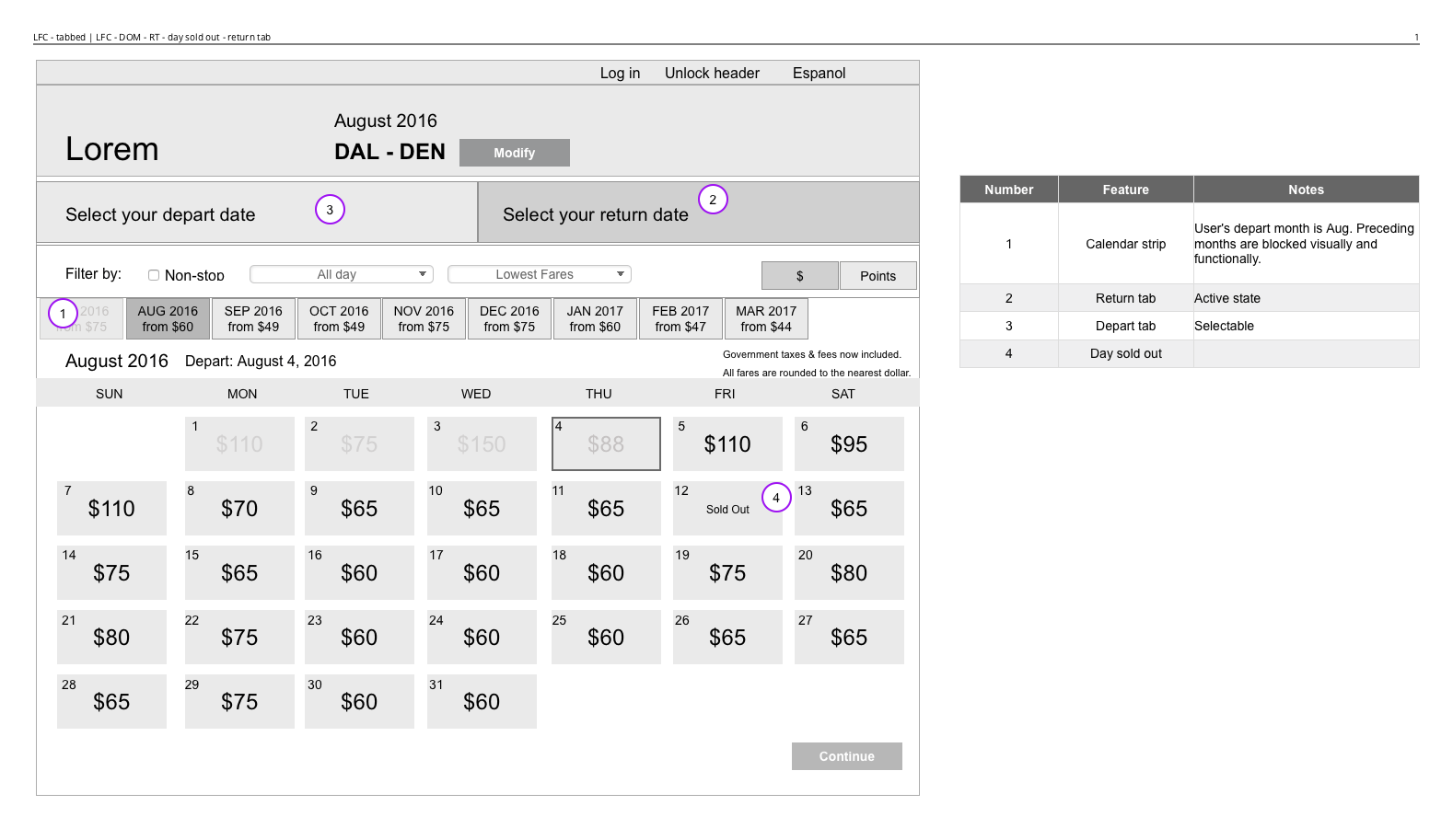
To further complicate matters, there was a requirement to show the selection of the outbound date on the return calendar view. After a Customer would select their depart date, they would need to click a continue button to have the calendar redraw with their previous selection active.
I raised initial concerns with the proposed direction, but I was lacking data to back up my intuition. I built a paper prototype of the new Low Fare Calendar and walked around various departments recruiting participants. I asked them to use the paper prototype to "book a flight" and had them think aloud, telling me what they would expect to happen at each point of interaction. Out of the 8 people sampled, not one expected to use the calendar in the way the requirements were set.
Usability Testing
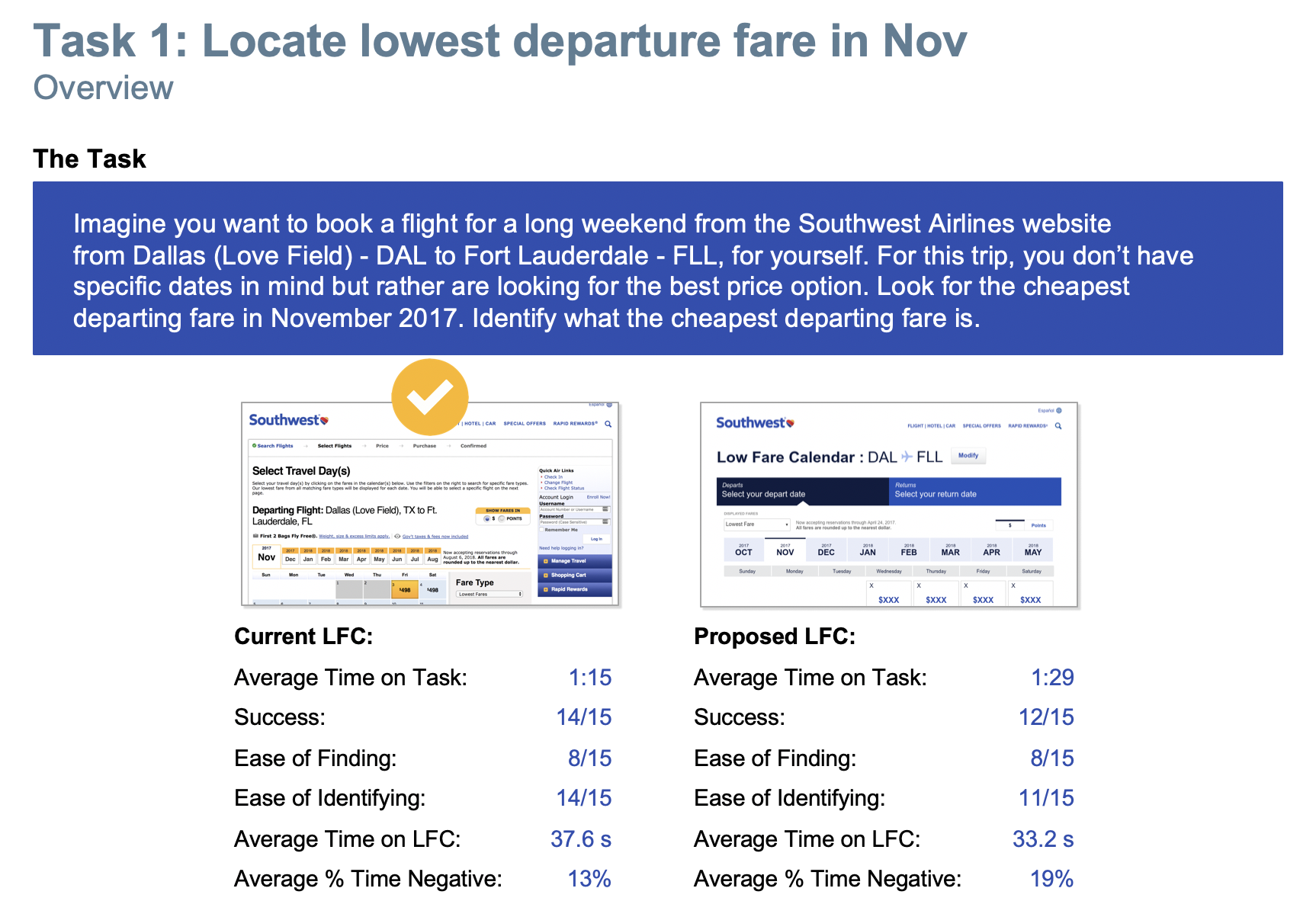
The paper prototyping results brought tangible data to leadership on the issues with the proposed direction of the Low Fare Calendar. To validate that the issue was not solely based on internal familiarity, we engaged with an external testing partner to run in-depth usability testing with Southwest Customers and non-Customers. I built out high fidelity prototypes of the new experience and our testing partners baselined the new experience against the existing.
Motion Study for Usability Prototype build out
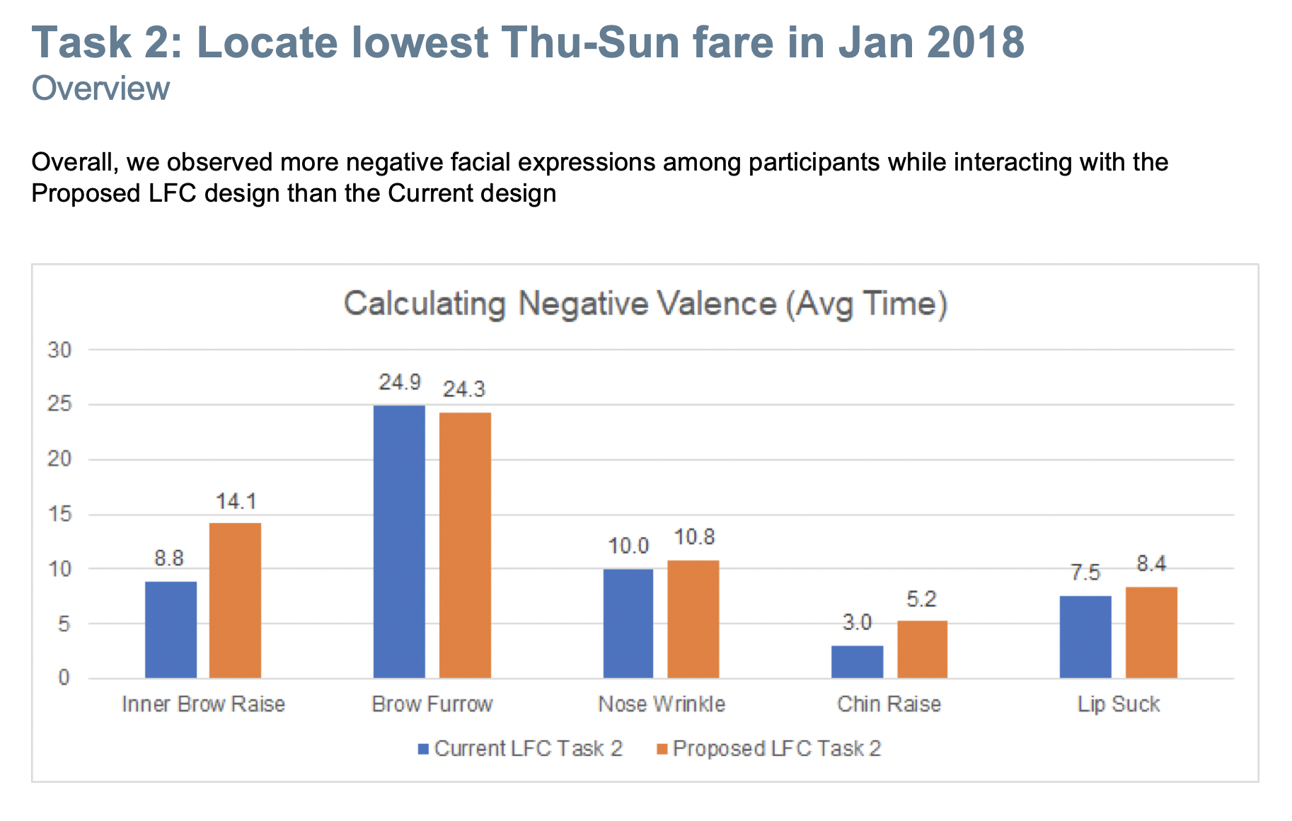
The results of the testing showed an overwhelming preference for the old design when compared to the proposed direction. While the visual design of the new Low Fare Calendar was appreciated by participants, they felt the combined calendar was confusing and unclear. By combining the calendars, participants stated it was difficult to accurately plan their travels.


These results allowed us to get leadership buy-in to adjust the experience. This also validated the requests the UX team had been making to do true user research and testing to validate design decisions before development starts. The metrics and guidance generated through usability testing allows for objective decisions and removes personal preference from internal stakeholders.
Revisions & Future Iterations
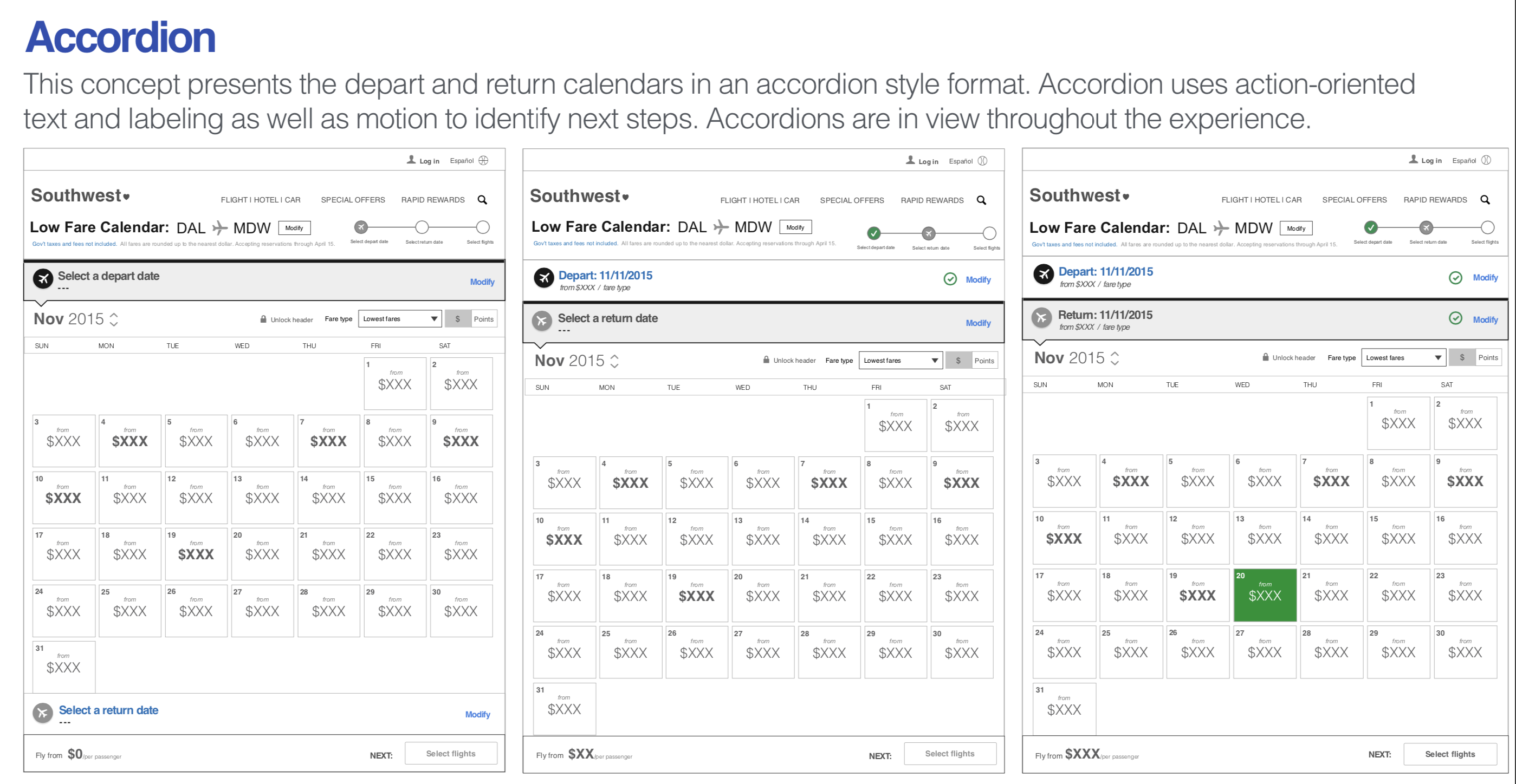
With the learnings from the usability testing, I was able to revamp the experience to better match Customer expectation. Instead of leveraging tabs, I stacked two calendars with clearly marked headers that call out which calendar goes with each part of a trip. I was able to layer in motion studies and this became the first part of Southwest.com that was built with UI animation to help delineate between different states.
There are many things I'd love to go and test on the Low Fare Calendar. I don't think this version is giving Customers the right amount of information density, and they have to hold too many price points in their head to do an effective shop. I think finding a way to condense the display of the calendar and building in a right rail that calls out what you are shopping for might make browsing and comparing flight options even better. I also would like to find ways to bring in the price charts, as well as refine how the trip duration is displayed.
While there are multiple ways the Low Fare Calendar experience could be improved, the launch was successful and it continues to meet or exceed all associated KPIs compared to the pervious version.